Thursday, 29 November 2012

How I edited my Magazine Cover


1 - This is the photograph I chose to use for my magazine cover. The composition is to the left, letting her hair tumble across her shoulder giving her a nice profile. This is the photograph before I did any editing to it.


2- This is the photograph when I used spot healing tool to clear up blemishes and used a Gaussian blur tool to smooth out the skin. Then I changed the colour saturation of the photography so that the colour was much more rich and bright. After this using the clone tool I used the dark bluish black colour of the backing sheet to replace all of the background giving the final product a clean background/


3- This is the photograph after I used a blue hue to get a desired pinkish-amber colour to the eyes of my model. The effect of the use of the huge however changed all of the picture's colour giving my model blue skin, purple hair and orange clothes.


4- This is the photograph after I opened a new layer of the step 2 and placed it over the photograph is step 3 before desaturated the photo so that the colour in the photograph was quite faint leaving a hint of colour for the hair, skin and lips. With this layer on top I then used the eraser tool to get rid of this layers eyes so that step 3's amber eye colour would replace it, giving my model and eerie look about her.


5- In this photography I have added my chosen text which is Old English Text MT, using it for my Magazine's title 'Status' as well as for the words 'The Sinner Cover Special' to create a little bit of uniformity. I chose this text because it was quite aesthetically pleasing for my film genre as its quite old fashioned and Gothic. However the words 'Behind the scenes' is in the font Rockwell Condensed. Making it stand out from the scriptic text. I also added a tagline the top right of the magazine in purple using the text Orator Std. The tagline is in a different font also as to be different from the rest of the magazine but in the colour purple to stay with the colour scheme. All text here was razturized and given a drop shadow to make it stand out against the white.

6-  In this photograph I have added more text using the font Rockwell Condensed promising Exclusive interviews with my main actress and information on the actors that should be watched this year. I coloured the font in red, purple and white so that the text stands out and is legible.


7- This is the finished) also I added a barcode to give the magazine more authenticity. I also made the shadow behind the magazine's title bigger to make it stand out more then the rest of the text.


Wednesday, 28 November 2012

Designing the Magazine Cover


These are the four favourite pictures that I took for my magazine front cover. They are all of my female actress wearing dark clothing and make-up to help bring out her pale conplextion and bright eyes. 


Having chosen these four picture as the once I would use for my magazine, I had to decide what text did I think I wanted to use over the top of the images. Below are the three different text types I chose to text out.


This text is Matura MT Script Capitals


This text is Viner Hand ICT


 This text is Old English Text MT


I also experimented with Photoshop to see what effects I could add to my work. Below are the three different effects I found aesthetically pleasing.


1- This is a basic black and white edit. Which mean that I would have to use only bright coloured text that can show up over black and white.However it give a nice dark atmosphere to the photo, like all the colour has been sucked out of it.

2- This a normal colour picture which has been hightened in colour enough to make the red lips and blonde hair stand out and give the model a pale complextion. However I would have to use a bright colour in a dark shade as for it to stand out enough to be legible.

3- This is a black and white edit that has been tweaked so that it shows the lips a pale green colour and give the black shirt a plum coloured tint. The text for this would have to be a shade that matches the green but is visible on black and white.

After looking at different editing styles, picture compersition and text styles, I made three different magazine covers, testing out different looks to see which one looked the best to show off my supernatural horror genre.


Cover #1 is a coloured edit which I lowered the saturation of to make the colours fade out so that there is only a hint of blonde colour in the hair. I then made the eyes a turquoise colour playing on the their natural colour which is blue. I also made the lips a pale pink colour to compliment the turquoise of the eyes. After this I added a title for my magazine along with a barcode, price, tagline and other news you expect to see on a magazine. All in pink and turquiouse to keep it with the colour theme and in the text Viner Hand ICT.

However I think that the colours are quite feminine so wouldn't appeal for people who enjoy the supernatural.


Cover #2 is a basic black and white edit which I have tampered with so that the black and white contrast more then they usually would. I then editied the eyes to that the natural blue of her eyes would come out and then I darkened them so that they we almost unnoticeable. After that I added the magazine title, price and barcode along with additional text about film related news and a tagline. All using the font Matura MT Script Capitals and colour white so it stands out against the black and grey.

However I feel that the monocrome style is a little plain even with the editing of the eyes to show dark blue.


Cover #3 is a normal coloured picture that I have hightened the colour of making the black darker so it frames the model's pale face and makes the red of her lips deeper. After putting the magazine title, price, barcode and film related news, I then decided to use the colour red for the text to compliment the red lips and chose the font Old English Text MT.

However I feel that there just too much red on the cover so perhaps I should break up the red with another colour.


So after some think and experimenting I final came up with the perfect magazine over.


I think that this is the best cover for my magazine because it has desaturation of the main image showing the colour is being drained away. The eyes are edited a shade of amber to make her look like a supernatural being. I then decided I liked the Old English Text MT text so i used it in red,purple and white as to make the text stand out against the almost greyscaled background.

Sunday, 18 November 2012

Trailer Settings Board


This is the kitchen in the film. Its a nice size so there is lots of room for the actors to act freely and room for me to manuver the camera around without knocking things over or being see at all during filming.


This is the dining room attached to the kitchen in the film. Its a bright open space so that the film will be well lit and the actors have a lot of space to move freely and for me to manuver the camera.


This is the hallway that my actor comes through to get to the living room. This is a good place because I can sit on the stairs and have a nice clean pan of him exiting the kitchen and crossing over to the living room.


 This is the top of the living room where Lily's ghost sits waiting for Caleb. The room is spacious and is obviously lived as there is suppose to be a young couple living there. There is lots of room for the actors to move and to fit a camera in.


This is the bottom of the living room where Caleb enters and sees Lily. The room is spacious and is obviously lived as there is suppose to be a young couple living there. There is lots of room for the actors to move and to fit a camera in.


This is the stairs and the landing where my male character runs up the stairs and finds the female ghost leaning against the wall waiting for him. This was a tight space for my actors to move in and to fit a camera, but once we had sorted thing out the filming ran smoothly.


This is the bedroom which Caleb and Lily shared together when Lily was alive. This is the place in which Caleb runs to in order to escape Lily's phantom. This is also the place where he remembers his gun in the draw with his police uniform and commits suicide.


Saturday, 17 November 2012

Costume and Props for Caleb

This is Caleb Tomsworth, our main male character in my film. This picture shows use how worn and unkempt he has become since the death of Lily and the beginning of her brief appearances as a ghost. You see his hair is unruly and has begun to grow facial hair.


This necklace that Caleb wears is whilst he is being haunted by Lily. It was given to him by his mistress to help calm down his anxiety and claims about being haunted by his wife, as the stone is Lapis Lazuli. A stone know for its properties to calm anxiety and it is also rumoured to help guard the wearer from psychic attacks.


I chose this t-shirt for Caleb because it is a plain colour which co-ordinates with Lily. Also it has a humorous picture on the front of a piranha seeing a donut on a hook. This can symbolise that the piranha is tempted by something. That Caleb is the Piranha and that donut is his mistress. Showing that Caleb was tempted by the idea of being with another women. Also it can fore-tell that Caleb would be caught out and suffer consequences.


I chose these jeans for Caleb because they are pale and in the centre and dark around the edge showing that they are well worn, possible quite old and now only worn for slobbing around the house.


I chose this watch as part of Caleb's costume as it is a sleek black watch with gold trimming and details. This shows that Caleb must have a pretty decent job to afford a flashy gold watch of gold and black leather.


I chose this prop as the weapon that Caleb uses to commit suicide as it would fit in with the fact that Caleb is a policeman and would have a gun.


Costume and Props for Lily

The importance of this post is that it shows that I have given thought to the clothing, jewellery and make-up of my actors. 


This is Lily Tomsworth, our main female character and the poltergeist in my film. This picture shows the make-up done for her when she is a ghost. Her face is noticablely paler to give her a more waxy and ghostly complexion. Her head has received a dark purple and grey bruise that shines against the pale skin, with a red cut in it. This shows that before Lily died, she was abused and this mark was left behind. The pale purple and pink, shadows beneath her eyes shows her to be worn out and enhances the paleness of her complexion and the bright blue of her eyes. Her lips are a dark pinky red to compliment the shadows, helping them to still seem reasonable shallow in colour and also helps to draw attention to the redness of the cut on her forehead.


This is the necklace which is part of her costume. I chose for her to wear this cross necklace because it shows that her religion is Christianity. That she belongs to a faith where there is promise that the believers of the faith will be either be reincarnated or taken to the kingdom of heaven. This also shows that there is either no such thing as the kingdom of heaven and that she is just haunting her husband because of despair over him cheating and that her faith as been a lie or that she has been sent back to earth to haunt her husband for his misdeeds and show him the error of his ways.


I chose this t-shirt as part of her Lily's costume as the colour of the shirt is grey a colour which isn't too bright that it takes the attention away from the make-up. Also the neckline is a modest cut, not too steep yet nice enough to show off the necklace. Also the cupped sleeves are quite modest. Not showy or showing off too much flesh which a wife would stereotypically not do.


I chose a pair of dark jean for Lily's costume. This is because a dark colour will help to Make her skin stand out paler then it would in pale clothing. Also because they a modest cut not showing off too much flesh. Also its typical now days to see housewife's wearing jeans at home.


These are Lily's engagement and wedding rings. The golden band is the wedding ring, the silver one with the opal stone is the engagement ring. I chose these two props because they show that Lily is married to Caleb and from how tarnished they are, for a long time.


This is Lily's lipstick. I chose this prop as it was a dark burgandy colour that would make her lips stand out and her skin look paler. This prop is used to show Lily putting it on like war paint for confronting her cheating husband.


This is the offending bra that belongs to Ivy. This is a prop for Lily as she uses it to show her husband that she has found out that he is cheating on her.


Friday, 16 November 2012

Theoretical Research - Vladimir Propp

This post is important as it shows that I have done some research on a theorist. Showing that I have taken an interest in the style that the theorist Vladimir Propp exercised.

Who is he?

Vladimir Propp is a Russian literacy scholar who analysed the basic things that were present in the storyline of Russian fairytales to establish the basic narrative elements that were used.

What did he find out about the narrative structure in Russian fairytales?

Propp found out that there are 31 different functions that happen after the initial story of a fairytale.

Some examples of these function are:

- Delivery: when the villain gains information about the hero which can be used to their advantage. Other types of delivery is finding a treasure location.

-Trickery: when the villain attempts to deceive the hero or victim to take possession of them or a possession of theirs.

-Struggle: when the hero and the villain of the story engaged in combat.

-Difficult Task: Hero has to overcome a task that involves riddles, puzzles or test of knowledge.

-Wedding: When the Hero marries the princess and takes over the throne.


What are some of the broad characters that he found in the tales he analysed?

1- The Villain: who struggles against the hero.

2- The Dispatcher: a character that makes the lack known and send the hero off on his/her journey.

3- The Helper: a character that helps the hero (sometimes they are magical)

4- The Princess/Prize: a character or item that the hero is in pursuit of but is unable to interact with  due to evil forces. In the end of the tale the hero usually marries the princess after vanquishing the villain or gains the prize.

5- The Hero: Goes on a journey for a reason like searching for an item to save a life or in search of a princess and ends up marrying her. Also the hero interacts with the villain and defeats him or her.


Actor/Character Profile's

The importance of this post is to outline the characters and the people who will be playing them.


Lily Tomsworthy:

Zaneta Williams will be the actress playing Lily. The character Lily is the wife of Caleb and is a housewife. So she doesn't go to work but looks after the well-being of the house. She has been married to Caleb for 4 years. She is a lover of reading books and drawing. She is also a strong Christian which is why she wears her gold cross necklace.

Caleb Tomsworthy:

Matthew Watson will be the actor playing Caleb. The character Caleb is the husband of Lily and he works the usual 9 to 5 day working as a Policeman. He is currently doing desk work because Lily worries about him being on active duty. Caleb enjoys comedy programs but isn't a fan of horror films. Caleb is Agnostic. Which means he doesn't know if we can tell if God exists.

Ivy Krazer

Natasha Barrett (me) will be the actress playing Ivy. The character Ivy is the Mistress of Caleb and works with him at the police station. They started talking when Ivy brought Caleb some tea one day and they hitted it off. Ivy enjoys writing and doing photography. Ivy isn't religious as it has never really crossed her mind.

Thursday, 15 November 2012

Questionnaire Results

This post is important as it shows the results of my questionnaire.


This shows that I asked the same amount of males and females to fill out my questionnaire. This was a good thing to do as it gives me a balanced opinion of people's view on film trailers.

This graph shows the different age groups that answered my questionnaire giving me a clear view at the age of my target audiences. As you can see from these results only 3 different age groups answered my questionnaire.

From this graph, we can see that about 60% of people who took my questionnaire actually like horror films. This is good because it doesn't just show horror films in the perspective of those who enjoy them, but those who don't too.

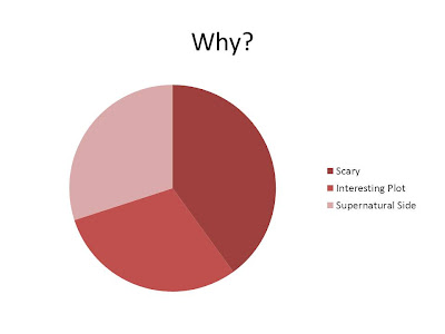
This graph shows me what the reason are that the people taking my questionnaire like or dislike horror films. As you can see here, 40% of people in my questionnaire think that horror films are scary which is the main reason why they like or dislike these films.

From this graph, we can see what film in particular do the people I ask actually like. We can see that 40% of people have The Grudge as their favourite film. Showing me that they enjoy the Japanese styles ghosts.

In this graph, we can see which genre out of these two that people prefer. The results show that people prefer psychological horrors more then slashers. This is because they mess more with your mind and makes you question your surroundings more and if ghosts actually exists whereas slashers are just about people murdering you.
In this graph, we are shown my audiences opinion on film trailers. This is good because 50% of my audience don't actually mind them and 30% actually think they are great. Showing me that there is a wide audience who like trailers.
In this graph, we can see that 50% of my audience liked film trailers as it gives them a peek at the films so they can decide if they liked it or not, however 20% of my audience actually feel that trailers can spoil the film.

In this graph, we can see that 60% of my audience prefer slow paced trailers so that they can keep up with what is happening in the film and also builds up tension as shots linger on screen longer than usual.

In this graph we can see that about 40% of the audience feel that they prefer this steady pace because it builds up tension which fits perfectly with the genre. Also a further 40% think slower paced trailers are less boring, as they are different to the usual fast paced trailer that are more common in this era.
 
From this post I have learned what people like in horror films and what their opinions are on film pace and genre preference.